We design PREMIUM Logos which you can Trademark © ® ™
Logo designer, Logo Company, Logo Maker
Every Logo / Client / Brand / Business is Unique!
So are our IDEAS, Please scroll down to view our Logo Portfolio

Logo Maker, Logo designer, Logo Design Company, Logo Design, Logo Artist

Logo Maker, Logo designer, Logo Design Company, Logo Design, Logo Artist

Logo Maker, Logo designer, Logo Design Company, Logo Design, Logo Artist

Logo Client
Bran-O
Mumbai, India


Director / Owner Info
Mr. Kunal Batra


Logo Concept
Harmoniously integrated typography based logo.
The selected font, balancing rustic charm with modernity, reflects the natural and wholesome quality inherent in baked goods.


A creative touch is added to the letter "R" in where it takes the form of a raw wheat stem extending upwards.


This visual element not only links the company's name with its primary ingredient but also symbolizes the foundational nature of wheat in its products.


With a brief tagline beneath the logo, emphasizing the company's commitment to healthy and nutritious offerings, this logo narrates a story of tradition, craftsmanship, and a dedication to quality in line of bread and baked goods.


Logo Work Done
Logo Design & Stationary Design

Logo Industry
Bread and baked goods manufacturing company Gomti Healthy Nutrients Private Limited

Logo Makers, top Logo designers, Logo Design Company india, creative Logo designers, creative Logo Artist


Logo Makers, top Logo designers, Logo Design Company india, creative Logo designers, creative Logo Artist

Logo Makers, top Logo designers, Logo Desig


Logo Client
E-Pansari
New Delhi, India


Director / Owner Info
Mr. Parul Bhatia


Logo Work Done
Branding, Logo Design

Logo Concept
In this astrologically influenced logo featuring a cart of essential groceries against a green backdrop, the color green is aligned with the astrological sign of Taurus. 

Taurus is associated with practicality and abundance, making it an ideal choice for a logo representing a cart filled with useful items.

The combination of green and the depiction of practical essentials signifies a grounded and prosperous offering, harmonizing with Taurus' attributes of stability and practical abundance.

This logo subtly connects astrology with the everyday essentials offered by your brand.

Logo Industry
Online Grocery Portal


n Company india, creative Logo designers, creative Logo Artist

Logo Client
E-Pansari
New Delhi, India


Director / Owner Info
Mr. Parul Bhatia


Logo Work Done
Branding, Logo Design


Logo Concept
In this astrologically influenced logo featuring a cart of essential groceries against a green backdrop, the color green is aligned with the astrological sign of Mercury.


The combination of green and the depiction of practical essentials signifies a grounded and prosperous offering, harmonizing with Taurus' attributes of stability and practical abundance.


This logo subtly connects astrology with the everyday essentials offered by your brand.


Logo Industry
Online Grocery Portal

Logo Maker, Logo designer, Logo Design Company, Logo Design, Logo Artist

Logo Maker, Logo designer, Logo Design Company, Logo Design, Logo Artist

Logo Client
Dev
UP, India


Director / Owner Info
Mr. Abhishek Rajput


Logo Concept
We Crafted logo as per astrology, who features an bold light blue font, radiating strength. Orbiting the brand name are four leaves, each symbolizing zodiac elements - two yellow for fire signs, one red for earth signs, and a green leaf for air signs.


This celestial palette and carefully crafted leaves create a visual tale, connecting the honey to cosmic forces shaping its flavors. Born from creative vision, this logo harmonizes astrology with the natural world, providing a distinctive identity resonating with the brand's celestial origins and the nuanced character of its honey.


Logo Work Done
Logo Design & Stationary Design

Logo Industry
Honey Supplier

Logo Maker bangalore, Logo designer bangalore, Logo Design Company bangalore, Logo Design bangalore, Logo Artist bangalore, Logo designer bangalore

Logo Makers, top Logo designers, Logo Design Company india, creative Logo designers, creative Logo Artist

Logo Client
Singla Spices (Chakshu Masala Brand)
Haryana, India


Director / Owner Info
Mr. Munish


Logo Concept
We crafted This food company logo, who combines a vibrant orange-to-red gradient background with a confident chef holding a burger, symbolizing culinary excellence.


A stylized sun adds warmth, emphasizing freshness. The white font maintains simplicity and elegance, creating a memorable representation of high-quality, flavorful dining.


Logo Work Done
Logo, Packaging Design

Logo Industry
Spices, Exporter, Food Products

No 1 Logo Makers, Logo designers, Logo Design, creative Logo Artist

Logo Client
Magflour


Director / Owner Info
M/s Abhishek Traders


Logo Creative Concept
In this premium logo Concept, an artistically crafted "M" takes center stage, crowned with a stunning leaf in a captivating red and brown gradient. The fusion of these hues symbolizes vitality and earthiness, creating a rich and elegant aesthetic.


Encircling the design are five stars, adding a touch of serendipity in alignment with the client's lucky numerology number. Majestic Foliage Harmony harmonizes artistic simplicity with the richness of nature, offering a sophisticated visual identity that resonates with both vitality and premium elegance.


Logo Work Done
Naming, Logo Design & Stationary Design

Logo Industry
Wheat Flour, Rice Flour, Jawar Flour, Besan etc

No 1 Logo Makers, Logo designers, Logo Design, creative Logo Artist

Logo Client
Magizhchi
Thanjavur, India


Director / Owner Info
Mr. Rahman


Logo Creative Concept
In this logo Concept, envision an elliptical backdrop serving as a canvas for artistic fonts. The company initial "M," crowned with regal elegance, takes center stage, while the letter "i" is subtly shaped as a candle, symbolizing illumination.


Adding a playful touch, a smiling "m" resides within the crown, introducing a sense of joy. The Crown Face shows Joy harmonizes sophistication and playfulness, offering a visually engaging identity that combines reality with a warm, joyful spirit


Logo Work Done
Logo Design

Logo Industry
Spices, Masala powder packed

Logo Client
Marketing Stellar
Bangalore, India


Director / Owner Info
Mr. Dilip


Logo Concept
The logo based on the principles of Vastu, Concept draws inspiration from the harmonious balance of nature and the structured elements that define this ancient philosophy.


The design features two elegantly stylized 'M's, seamlessly merging to resemble majestic mountains. These symbolic peaks represent stability, strength, and a grounded foundation—the core tenets of Vastu.


The choice of blue and red hues in the logo adds depth and significance. Meanwhile, the red hues signify passion, vitality, and the vibrant life force that flows through all elements.


Logo Work Done
Branding, Logo Design & Stationary Design, Broucher

Logo Industry
Marketing, Multi Business


Logo Makers, top Logo designers, Logo Design Company india, creative Logo designers, creative Logo Artist

Logo Client
Cheflike
New Delhi, India


Director / Owner Info
Mr. Akshat Agarwal


Logo Concept
In this logo Concept, a sun is utilized as an astrological symbol, embodying vitality and energy. Adjacent to the sun, two plants are artistically shaped to resemble human figures, subtly suggesting growth, harmony, and the essence of nature.


The modern fonts in a refreshing green color add a contemporary touch, reinforcing the idea of freshness and innovation. This Concept indirectly reflects the vibrancy, growth, and natural harmony that align with the world of kitchen equipment without explicitly stating its connection to the industry.


Logo Work Done
Branding, Logo Design & Stationary Design, Brochure

Logo Industry
Kitchen Equipments

No 1 Logo Makers, Logo designers, Logo Design, creative Logo Artist

Logo Client
Black Sunflower
Haridwar


Director / Owner Info
Mr. Rajesh Kumar


Logo Creative Concept
In this logo Concept, envision a celestial harmony crafted with six golden elements forming a rounded star on a regal purple background. Symbolizing balance and cosmic unity, the design creates a visual symphony against the cosmic backdrop.


Artistic fonts complement the celestial theme, adding a touch of creativity and elegance. This Concept seamlessly combines numerology, the richness of golden hues, and cosmic allure to resonate with a harmonious visual identity.


Logo Work Done
Logo & Stationary


Logo Industry
FMCG Product

Logo Maker bangalore, Logo designer bangalore, Logo Design Company bangalore, Logo Design bangalore, Logo Artist bangalore, Logo designer bangalore

Logo Client
VYU
New Delhi, India


Director / Owner Info
Mr. Pawan Kalra


Logo Creative Concept
The logo Concept seamlessly combines the company's initials with four gracefully stylized leaves, embracing the client's numerological affinity for the number four.


Executed in a calming purple gradient, the design exudes sophistication and balance. The modern, refined typography ensures clarity, allowing the floral element to stand out.


This emblem symbolizes simplicity, unity, and a flourishing essence, aligning with the client's desire for a meaningful representation of growth and prosperity


Logo Work Done
Logo & Stationary


Logo Industry
Home Air Fresheners

Logo Design company, Global logo design company, Builders logos design

Logo Client
Bab Al Rahmanaeya
Sharjah, UAE


Director / Owner Info
Mr. Sanjay Vincent


Logo Creative Concept
The logo is from numerical theory -The number 5 is associated with versatility, adaptability, and dynamic energy.


Logo Work Done
Logo

Logo Industry
Grocery Store Chain


Logo Client
Deepak Dairy
Pune, India


Director / Owner Info
Deepak Dairy


Logo Creative Concept
In this logo Concept, a gently curving shape reminiscent of a pouring milk splash. Within this fluid and dynamic design, a delicate and welcoming smile emerges, evoking feelings of warmth and satisfaction often linked to the consumption of dairy products.


The absence of additional elements creates a sense of simplicity and purity, mirroring the straightforward nature of milk.


The combination of the milk-inspired shape, smile, and artistic typography crafts a distinctive and memorable visual representation, suggesting a brand committed to delivering a delightful and high-quality dairy experience without explicitly stating its association with milk and milk products.


Logo Work Done
Logo Design & Stationary Design

Logo Industry
Manufactures and Wholesellers of milk and milk Products

Website
http://www.deepakdairy.com

We are #1 in Logo Design Company, Product Logo Design, Packaging Design, Packaging Logo Makers, FMCG Product Logo Artist
packaging design, Logo Maker mumbai, Logo Design Company mumbai, Logo Artist mumbai, Logo designer mumbai

packaging design, Logo Maker mumbai, Logo Design Company mumbai, Logo Artist mumbai, Logo designer mumbai

packaging design, Logo Maker mumbai, Logo Design Company mumbai, Logo Artist mumbai, Logo designer mumbai

packaging design, Logo Maker mumbai, Logo Design Company mumbai, Logo Artist mumbai, Logo designer mumbai

packaging design, Logo Maker mumbai, Logo Design Company mumbai, Logo Artist mumbai, Logo designer mumbai


Logo Client
Eminence Saffron
Bangalore, India/ Iran


Director / Owner Info
M/s Qeshm International Trading


Logo Creative Concept
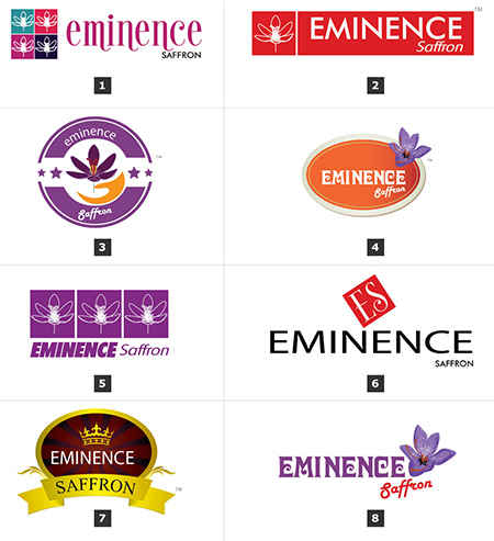
A rich backdrop of dark and light brown, reminiscent of the saffron spice, an elegant oval shape takes center stage. The oval signifies completeness, unity, and the holistic approach of the brand in the saffron trade.


At the top of the oval, a stylized crown, infused with the warmth of yellow edges, symbolizes the upward trajectory of growth and success business. Below the oval, the company name is presented in modern fonts, adding a touch of sophistication and professionalism.


The color palette and design elements harmonize to create a logo that resonates with the aromatic and premium qualities of saffron, portraying the brand as a distinguished player in the import/export market.


Logo Work Done
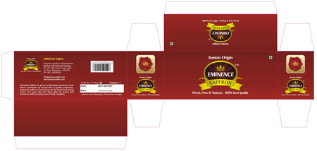
Logo, Stationary Design & packaging

Logo Industry
Saffron Exporter

No 1 Logo Makers, Logo designers, Logo Design, creative Logo Artist

Logo Client
Doorva international
Daliganj, Lucknow


Director / Owner Info
Mr. Arvind Agarwal


Logo Creative Concept
Doorva is a sanskrit word which means grass a special type of grass which is very soft in nature, and the smallest thing which signifies humbleness, survival capacity (tendency to regain its position after being trampled).


Above all it is most essential for the worship of lord Ganesha, without it one can't complete the worship of lord Ganesha, Without worship of Lord Ganesha  one can not Start any good work or Anusthan. It was a wish that we would build a institute which became essential for everyone who is related to this trade.


The logo is designed with a 3D feel combining human, star, grass, trunk of Ganesha, with eye pleasing colors.


Logo Work Done
Logo Design & Stationary Design

Logo Industry
Radiology and pathology products, which helps to perform X ray and clinical test of a patient. Doorva international is situated in lucknow performing since last 17 years.

Working in more than ¼ of nation with high standards of business ethics we are purely in distribution of products.


FMCG Product logos Design, FMCG Product Logo Designs, FMCG packaging design, FMCG Product Branding & Packaging Design, FMCG Logos


Logo Client
Food Plus
Bangalore,India


Director / Owner Info
Mr. Farhad Ahmed


Logo Creative Concept
In this vibrant and energetic logo Concept, simplicity meets dynamism to create a visually engaging representation of our brand. The primary element is a set of simple yet sleek blue fonts, exuding a sense of professionalism and trust.


The clean lines and contemporary style of the fonts establish a modern and versatile visual identity. Adding a burst of color and playfulness, six multicolored dots are artfully arranged at the end of the logo.


These dots not only introduce a lively and dynamic element but also symbolize diversity, creativity, and the spectrum of possibilities our brand encompasses.


Logo Work Done
Logo Design, Stationary Design

Logo Industry
Food Store Chain

Logo Makers, top Logo designers, Logo Design Company india, creative Logo designers, creative Logo Artist

Logo Client
Nufarm Frozens Pvt. Ltd.
UP, India


Director / Owner Info
Mr. Divyanshu Agarwal


Logo Creative Concept
In this themed logo Concept, a triangular shape represents the harmonious blend of natural elements—fields and jungle—creating a balanced and eco-friendly environment.


Inside the triangle, these elements symbolize the diverse offerings of the brand. The rectangle complements this by framing the scene, providing structure, and housing the company name.


The composition reflects the brand's commitment to sustainability, diversity, and a well-rounded approach to its offerings.


Logo Work Done
Branding, Logo Design & Stationary Design

Logo Industry
Frozen Food Importer & Exporter

Industrial Logos designer, Industrial Logo design Company, India logo design, India logos, India affordable logo design, India Logo designers, Top logo companies

Logo Client
Joping
Mumbai, India


Director / Owner Info
Mr. Damodar Suthar


Logo Concept
In this simple and sleek logo Concept, the design is centered around clean blue fonts, projecting a sense of reliability and professionalism. Adding a subtle touch, a small upward gray arrow is positioned at the head of the letter 'I,' symbolizing progress, growth, and positive direction.


The blue color exudes trust and stability, while the gray arrow introduces a modern and dynamic element to the design.


This minimalist approach ensures the logo is versatile and easily recognizable, making it an effective representation for a brand seeking clarity and a contemporary visual identity.


Logo Work Done
Logo

Logo Industry
Multi trade

Logo Makers, top Logo designers, Logo Design Company india, creative Logo designers, creative Logo Artist

Logo Makers, top Logo designers, Logo Design Company india, creative Logo designers, creative Logo Artist

Logo Client
Cream n Frost
Visakhapatnam, India


Director / Owner Info
Mr. Philip Timothy


Logo Creative Concept
In this themed logo Concept, a dark brown background sets a rich tone, symbolizing stability and earthiness. Three layers of cream shapes represent a harmonious blend, subtly evoking a sense of balance and depth.


The incorporation of four hearts, in alignment with numerology, signifies a foundation of stability and a practical approach. The use of crazy modern fonts adds a touch of playfulness and creativity to the design.


Logo Work Done
Branding, Logo Design & Stationary Design, Broucher

Logo Industry
Manufacture of Frozen Dessert & Ice Cream

View Logo Design Gallery >>