Every Logo / Client / Brand / Business is Unique!
So are our IDEAS, Please scroll down to view our Logo Portfolio
Get your Logo designed from an International LOGO designer 'Sushant' - ADOBE Showcase Winner

Logo Client
Gawli Mandap Decorators
Mumbai, India
Director / Owner Info
Mr. Namdew
Logo Concept
This Vastu-inspired logo Concept for a mandap decorator is elegantly crafted in the serene style of a mandala art form. The logo features five distinct designs 'G', symbolizing the five elements at the of Vastu – Earth, Water, Fire, Air, and Space.
Each mandala is intricately designed in soothing shades of blue, representing tranquility, harmony, and the vast expanse of the cosmic elements.
Logo Work Done
Logo Design & Stationary Design
Logo Industry
Mandap Decorators & Contractor
Logo Client
Kailash Dairy
UP, India
Director / Owner Info
Mr. Gaurang Gupta
Logo Concept
In this themed logo Concept, a cow peacefully grazes in lush green grass, symbolizing the natural and wholesome source of dairy products.
The cow, rendered with a sense of tranquility and health, reflects the quality and care associated with the brand Complementing this pastoral scene, the fonts are designed in a milky style, adding a playful touch and aligning with the dairy theme.
The milky fonts not only reinforce the brand's focus but also contribute to a cohesive and thematic design.
Logo Work Done
Branding, Logo Design & Stationary Design, Broucher
Logo Industry
Manufacturer of Desi Ghee, Dairy Products
Logo Client
Biomeg Lifecare Pvt. Ltd
Lucknow
Director / Owner Info
Mr. Jasjit Singh Ahluwalia
Logo Concept
We crafted this themed logo. The logo is ingeniously shaped like DNA strands, symbolizing the brand's commitment to the essence of life and natural elements and connectivity to their clients.
The color palette transitions from green to blue in a gradient, symbolizing growth, freshness, and a dynamic progression. The fusion of these colors represents the brand's dedication to both environmental consciousness and innovation.
Simple fonts, gracefully presented in the same green and blue gradient, add a modern touch while maintaining clarity and readability.
Logo Work Done
Logo, Stationary & website Design
Logo Industry
Sales & Marketing
Logo Client
The Bigroof Engineering & Construction
North-Goa
Director / Owner Info
Mr. Radish K Madhavan
Logo Concept
This typographical logo Concept seamlessly blends modernity with Vastu principles, catering to the engineering domain. The focal point is a symbolic 'B,' representing both the brand and the foundations of construction.
At the core of this letter, two triangles converge, forming an intricate structure reminiscent of a building. The use of triangles aligns with Vastu's geometric principles, signifying balance, stability, and a harmonious blend of elements.
The overall design mimics the silhouette of a building, capturing the essence of architectural precision and engineering prowess.
Logo Work Done
Logo & Stationary
Logo Industry
Engineering & Construction
Logo Client
First Concept
Gurgaon, India
Director / Owner Info
Mr. Sandeep Kumar Mehta
Logo Concept
In this numerology-inspired logo Concept, the circular shape forms the foundational element, symbolizing unity and completeness.
These colors are carefully selected to resonate with numerological energies – red for passion and vitality, green for growth and balance, blue for communication and trust, and golden for abundance and prosperity.
The geometric interplay within the circle aligns with numerology's emphasis on balance and harmony. Each rectangle represents a numeric influence, contributing to the overall energy of the logo.
The use of these vibrant and harmonious colors not only adds visual appeal but also reflects the diverse energies associated with numerological symbolism.
Logo Work Done
Branding, Logo Design & Stationary Design, Broucher
Logo Industry
Events, Production
Logo Client
Greene's
Sikkim, India
Director / Owner Info
Dr. Rathang Chattopadhya
Logo Concept
This logo Concept is designed around a distinguished shield shape, exuding strength, protection, and reliability. The gradient effect adds depth and dimension, creating a visually appealing and dynamic emblem.
Complementing the shield is a set of 3D fonts, also in a silver gradient, adding a touch of contemporary flair. The three-dimensional aspect of the fonts enhances the overall design, lending a sense of depth and prominence.
The silver gradient, synonymous with prestige and innovation, further reinforces the brand's commitment to excellence.
Logo Work Done
Logo
Logo Industry
Dental Hospital
Logo Client
Luck Stone
Lucknow, Uttarpradesh
Director / Owner Info
Mr. Mohammad Shahid khan
Logo Concept
In this logo Concept, main element "L" is seamlessly embedded with a dynamic wing, forming an integrated and harmonious design. The circular background serves as a unifying element, symbolizing completeness and cohesion within the brand.
The wing, seamlessly integrated with the "L," symbolizes growth, freedom, and the brand's forward-looking spirit. It gracefully covers the circular background, adding a sense of movement and progress to the design.
A rich matte brown color envelops the entire logo, radiating warmth, stability, and authenticity. This color choice enhances the brand's grounded and trustworthy image.
Logo Work Done
Logo & Stationary Design
Logo Industry
Customised furniture
Logo Client
Sont
Director / Owner Info
Sont
Logo Concept
In this captivating artistic logo Concept, brand's first letter with a dynamic 3D feel. The letter is adorned with a multicolored flag, symbolizing diversity, vibrancy, and a global perspective.
This artistic element adds a unique and visually engaging touch to the design. A light circle elegantly covers the 'S,' creating a subtle yet impactful effect. This circle signifies unity and inclusivity, highlighting the brand's commitment to bringing people together.
The chosen color palette consists of rich purple and deep blue hues. Purple represents creativity, luxury, and uniqueness, while blue conveys trust, stability, and depth.
Logo Work Done
Logo & Stationary Design
Logo Industry
Multibusiness
Logo Client
Play Pen Pre School
Gujrat, India
Director / Owner Info
Mr. Prakash Patel
Logo Concept
The logo depicts a stylized representation of a house that is emblematic of safety, care, and a nurturing environment.
This symbolizes a place where early childhood development is fostered.
The use of circles to create the outline of the house suggests an approach centered around community and wholeness; each dot could be seen as an individual young learner, coming together to form a cohesive and supportive educational setting.
The typography underneath is bold and playful, imparting a sense of friendliness and accessibility. The name 'PLAY PEN' combined with 'CUM PRE SCHOOL' conveys the dual function of the institution: providing an area for play and interaction, as well as structured pre-academic readiness.
Overall, the logo signifies a welcoming space dedicated to the growth and education of children in their formative years.
Logo Work Done
Logo Design
Logo Industry
Play School, Education
Logo Client
Eqsmart Solutions PTE LTd.
Singapore
Director / Owner Info
Mr. Siva Prasad Nath
Logo Concept
We crafted this Vastu principles inspired logo, the design center around a house shape, symbolizing stability, harmony, and a strong foundation. Five dotted pillars support the house structure, each carefully placed to represent the five elements of Vastu.
Three pillars in orange signify energy, enthusiasm, and warmth, while the remaining three in green represent balance, growth, and tranquility. The rounded and bold fonts, in a calming green color, complement the overall design.
The green hue signifies balance, nature, and positivity, aligning with the principles of Vastu for a harmonious living environment.
Logo Work Done
Logo Design & Stationary Design
Logo Industry
IT Project Management, App Development & Maintenance And Providing IT consultancy service.
Logo Client
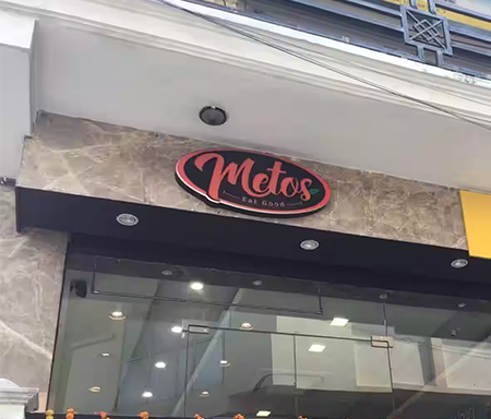
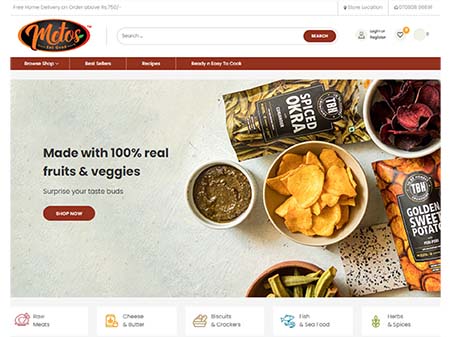
Metos
Lucknow
Director / Owner Info
Metos
Logo Concept
We crafted this vibrant and flavorful themed logo, the design is a visual feast that stimulates the senses. The logo is set against a sleek matte black background, creating a sophisticated backdrop that accentuates the vibrancy of the elements.
The central focus is a delectable smile, exuding the joy and satisfaction that comes from savoring delicious food. The smile is tastefully crafted in orange, radiating warmth and energy.
Adjacent to the smile, a fresh green leaf, outlined in red, introduces an element of freshness and natural goodness. The leaf signifies the use of fresh, quality ingredients in the culinary offerings of the restaurant.
Logo Work Done
Logo & Stationary Design
Logo Industry
Variety Of Frozen Veg & Non Veg
Logo Client
Angels Broking
Maharashtra, India
Director / Owner Info
Mr. Amit Shah
Logo Concept
In this Vastu-inspired logo Concept, logo features a rounded rectangle in a light blue color, representing tranquility and balance.over this background, a white mansion is elegantly placed.
The mansion symbolizes stability, prosperity, and a well-balanced living environment. The white color reflects purity and positive energy, creating a sense of harmony within the design.
Simple and rounded fonts in blue color complement the overall aesthetic. The blue hue reinforces the calming and trustworthy qualities, aligning with the Vastu philosophy of creating spaces that promote well-being.
Logo Work Done
Logo Design, Business Cards, Monogram for Diary
Logo Industry
Share Market, Investment, Consulting
Logo Client
AL-Med Agencies
Kashmir, India
Director / Owner Info
Mr. Aamir Abbas
Logo Concept
In this compelling logo Concept, a circular shape serves as the canvas, symbolizing unity and completeness. Inside this circle, two hands delicately cradle a plus sign, forming a powerful emblem of care, medical support, hospitality and positivity.
The hands represent collaboration and a sense of togetherness, while the plus sign signifies the brand's commitment to adding value and making a positive impact.
Logo Work Done
Logo & Stationary Design
Logo Industry
Medical Equipments, Cardiac Stents, Pacemkers, Gastro Products & Medicines
Logo Client
Resemble Systems
Karnataka, India
Director / Owner Info
Mr. Nazir
Logo Concept
We crafted a logo with a dark black-gray background, fostering a sense of stability and strength. The central focus is a prominent and modern "X" that symbolizes innovation and forward-thinking.
Surrounding it, subtle and calming light blue typography complements the overall design, promoting a tranquil atmosphere. The thoughtful balance of dark and light elements follows principles of harmony, creating a visually appealing and memorable logo.
This design aims to convey a sense of timeless elegance and innovation, capturing attention while exuding a serene and balanced energy.
Logo Work Done
Logo Re-Design
Logo Industry
ITes, IT, Software
Logo Client
Midvan Collections
Kolkota, India
Director / Owner Info
Ms. Parul Goyal
Logo Concept
We crafted this logo Concept where multiple spikes form a rounded shape, resembling both ocean waves and dynamic energy. The fusion of blue and gray hues captures the essence of the ocean, while white fonts on a black background add a touch of contrast and clarity.
This Concept, Oceanic Spire Fusion, is tailored for a brand seeking a visually striking logo that blends the elements of fluidity and modernity in a memorable design
Logo Work Done
Logo Design
Logo Industry
Fashion, Garment Export, Historical Replicas
Logo Client
Life Circle
New Delhi, India
Director / Owner Info
Mr. Anant Kumar
Logo Concept
In this logo Concept, a vibrant green circular shape forms the foundation, symbolizing growth, well-being, and balance. Within this circle, the company name is elegantly written in rounded letters, creating a sense of continuity and unity.
At the core of the circular design, a caring nurse is depicted holding a plus sign. This iconic imagery represents the brand's commitment to healthcare, wellness, and providing positive support.
The nurse symbolizes compassion, expertise, and a dedication to enhancing the overall well-being of individuals. The green color palette is chosen for its association with health, vitality, and nature, reinforcing the brand's focus on holistic well-being.
Logo Work Done
Logo Design
Logo Industry
Elderly Aid Service, Medical Service
Logo Client
Adroit Marketing
Uttar Pradesh, India
Director / Owner Info
Mr. Arjun Vyas
Logo Concept
In this logo Concept inspired by numerology, the design takes the form of an eye-shaped emblem. The eye is a powerful symbol representing intuition, awareness, and vision, aligning with the principles of numerology that emphasize spiritual insight and balance.
The eye is composed of two fluid blue curved lines, symbolizing harmony, duality, and the balance of opposites.
Within the eye, a mesmerizing pattern of black and white dots creates a captivating focal point, forming a symbolic representation of the numeral "8" – the number associated with balance, infinity, and the cyclical nature of life.
Logo Work Done
Logo Design, Print Material
Logo Industry
Security Equipments, CCTV Cameras, Communication Devices
Logo Client
GTC
Uttar Pradesh, India
Director / Owner Info
Mr. Sandeep Gupta
Logo Concept
In this dynamic logo Concept, a forward-looking design is achieved with a ball shape adorned with vibrant green and blue stripes.
The ball symbolizes unity, completeness, and a holistic approach, while the green and blue stripes convey a sense of forward movement and progress.The green and blue color palette is intentionally chosen to represent growth, harmony, and stability.
The stripes, arranged in a way that gives the impression of propelling forward, add a touch of dynamism to the overall design. This visual representation aligns with the idea of moving forward with energy and purpose.
Logo Work Done
Logo Design
Logo Industry
Sports Items, Toys, Exporter
Logo Client
Bricks Marketing Limited
Orissa, India
Director / Owner Info
Bricks Marketing Limited
Logo Concept
In this vibrant logo Concept, a series of multicolored squares seamlessly come together to form an upward arrow, symbolizing growth, progress, and positive momentum.
The squares, in shades of blue, yellow, and pink, represent diversity, dynamism, and a harmonious blend of energies.
The blue color signifies trust, stability, and reliability, while yellow evokes warmth, positivity, and energy. Pink adds a touch of creativity, playfulness, and a modern aesthetic to the overall design.
Logo Work Done
Logo Design
Logo Industry
Markteting, Dotcom, MLM Company
Logo Client
WMD Insurance
Glasgow, UK
Director / Owner Info
Ms. Lynne Baird
Logo Concept
In this numerology-inspired logo Concept, the design revolves around the auspicious number 8. Eight stars are artfully arranged, forming a celestial pattern that symbolizes balance, infinity, and cosmic harmony.
The stars are set against a serene blue rectangular background, resembling a globe. The blue color represents depth, wisdom, and a connection to the vastness of the universe.
The combination of the stars and the globe alludes to a harmonious blend of celestial energies with a worldly impact, echoing the principles of balance and infinite possibilities associated with the number 8.
Logo Work Done
Logo Restoration
Logo Industry
Insurance
© iMedia Ad Agency
www.logo-company.in
~Guru Aum Sushant Ji's Spiritual Website~
www.ShivaBlessings.com
(Business Astrology Numerology Vaastu Gemstones Rudraksha Yantras)
